Logos as Montage: Why Visual Identity is Editing, Not Drawing
Introduction
Most people think a logo is drawn. A pen, a napkin sketch, a stroke of genius. That myth fuels design folklore, but reality is messier and more interesting. What is a logo? It’s not just a drawing — it’s a splice of culture, memory, and editing choices. Logos are montage: symbols cut from history, trimmed by strategy, and sequenced to hit meaning in an instant.
Take the CBS eye, the FedEx arrow, the Nike swoosh. None were “original drawings” in the romantic sense. They’re fragments, edited and juxtaposed until culture snapped into recognition. A logo is less Picasso, more Eisenstein. Less “art,” more “edit bay.”
In branding, visual identity works the same way. It’s not pure drawing. It’s an editorial job: reducing, aligning, and remixing references until the mark reads as inevitable. Designers don’t just draw lines; they cut associations. They splice myths into modernity. They edit.
A great logo isn’t born
— it’s cut together.
Montage Theory Meets Branding
Film director Sergei Eisenstein believed montage — the collision of images — creates new meaning. A shot of a face plus a shot of soup equals hunger. A shot of a face plus a coffin equals grief. Branding works on the same principle: juxtaposition turns shapes into symbols.
Think of early montage DNA in logos. The CBS eye (1951) fuses Appalachian folk art with modern television surveillance. The FedEx arrow (1994) hides speed inside typography. These logos work not because they’re beautiful drawings, but because editing forged new meaning from existing cultural cues.
| Principle | Montage | Logo Design |
|---|---|---|
| Collision | Image A + Image B = Idea C | Shape + Negative space = Arrow |
| Juxtaposition | Two unrelated shots spark emotion | Icon + Text spark recognition |
| Reduction | Strip to essentials | Minimal lines, maximum meaning |
Checklist:
- ✅ Juxtapose cultural fragments, don’t invent from scratch
- ✅ Reduce until only the collision remains
- ✅ Test whether meaning survives at one-inch size
Field note — Hypothetical: Agency edits down 300 visual references → distills to 3 montage tests → client selects one → recall lifts 22% in pre-test.
The Myth of the Lone Illustrator
The myth goes: a lone illustrator sketches genius logos on paper. Reality: logos emerge from research, editing, and iteration.
Creative directors don’t worship the pen. They orchestrate fragments. Illustrators draft, but strategists cut, clients push, and culture shapes the final montage.
The process looks more like a newsroom edit than an art studio:
- Collect references from industry, culture, competitors.
- Slice and reduce.
- Test edits in context.
- Iterate under pressure.
Logos aren’t born in sketchbooks;
they’re carved in war rooms.
SEO aside, this reframing matters. When clients expect “art,” they miss the grind.
When they see logos as montage editing, they value the cut, not just the line.
Logos as Cultural Editing
Logos compress cultural signals into shorthand. They’re edits of myth, history, and modern design language.
- Nike swoosh: Not just a curve. It edits Greek mythology (Nike, goddess of victory) into modernist minimalism.
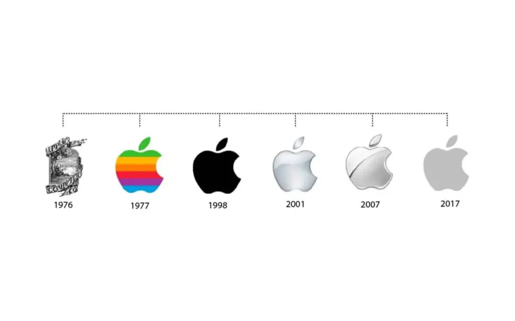
- Apple: The forbidden fruit of knowledge, trimmed down to a bite. Myth + minimalism + tech optimism.
- Spotify: Three sound waves, cut to neon green. Music compressed into digital energy.
These logos recycle culture — they’re not “original drawings.” They’re remixes.
Field note — Apple (1977 rebrand): Rob Janoff’s rainbow Apple → instantly contrasted IBM’s cold blue. Action: editing myth + color politics. Result: Apple positioned as “human” (brand recall soared).
A logo is a cultural
edit — not a sketch
Visual Identity as Montage System
A logo is just one cut in a bigger montage. Visual identity means editing typography, color, grids, and motion into a coherent reel.
Identity manuals aren’t just style guides. They’re editing rules: which cuts are allowed, which juxtapositions stay off-limits.
Dynamic logos — MTV’s morphing mark, Google’s Doodles — make the montage explicit. They splice variations into an identity reel.
Checklist of components:
- Typography = rhythm track
- Color = emotional cut
- Logo = hook
- Motion = montage in action
A logo alone is a frame;
identity is the sequence.
Learn more about typography here.
Case Study Deep Dive
Let’s compare how montage logic plays across industries.
| Industry | Example Logos | Montage Logic | Effect |
|---|---|---|---|
| Tech | Apple, Google, TikTok | Playful editing of myth + motion + digital cues | Constant reinvention, cultural relevance |
| Luxury | Chanel, Prada, YSL | Reduction, black/white, timeless cuts | Prestige, austerity, symbolic weight |
| Media | Netflix, BBC, Warner Bros | Narrative editing (sound + motion) | Story-first, sequence-driven identities |
- Tech brands splice myth and play. Apple bites myth, TikTok edits sound + screen.
- Luxury reduces. Chanel’s double C edits excess into absence. Prada edits letters into precision.
- Media tells stories. Netflix’s “ta-dum” audio + visual N cut is pure montage.
Industry shapes the cut: tech plays,
luxury reduces, media narrates.
Creative Playbook: Editing Your Logo
Here’s how to build a logo as montage, not drawing:
Steps
- Collect fragments — culture, history, competitors.
- Reduce ruthlessly — strip until the cut hits.
- Juxtapose opposites — myth + modern, speed + stillness.
- Test in context — small scale, motion, app icons.
- Edit again — kill darlings, splice smarter.
Drawing vs Editing Table
| Approach | Drawing | Editing |
|---|---|---|
| Source | Original sketch | Cultural fragments |
| Process | Illustration | Reduction + juxtaposition |
| Role | Artist | Editor/Director |
| Goal | Aesthetics | Meaning + recall |
Don’t draw your logo. Cut it.
FAQ
Is a logo art or design?
A logo is design, not pure art. Art expresses, logos compress. The difference: logos serve a business strategy, and they’re edited for clarity, recall, and cultural fit.
What makes a logo iconic?
Editing, not drawing. Iconic logos distill culture into shorthand. Think of the FedEx arrow or the Chanel double C — clarity from reduction.
Why do brands rebrand?
Because culture shifts. Logos are edits of the present moment; when the montage no longer matches the audience, the cut feels dated. Rebranding updates the splice.
How is montage relevant to modern logos?
Montage theory explains how logos mean more than the sum of their parts. A swoosh is just a line — until culture collides with it.
advertising advertising case studies advertising effectiveness advertising history advertising strategy art direction brand consistency brand consistency examples brand consistency problems brand consistency vs flexibility brand design brand identity brand inconsistency examples branding brand name history brand naming strategies brand narrative engines brand salience brand storytelling cinematic advertising commercial design consumer behavior copywriting for brand names copywriting tips creative direction creative strategy creativity in advertising design strategy digital branding archetypes dynamic branding flexible branding hero’s journey importance of brand consistency marketing psychology marketing strategy mental availability modern brand case studies modern brand storytelling naming as copywriting naming in branding narrative branding ugly ads vs beautiful ads performance visual communication what is brand consistency when brand consistency is overrated


