Introduction
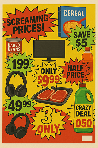
You’ve been told to reduce visual noise your whole career. Clean design. White space. Minimalism. But here’s the kicker: sometimes ugly sells. When ugliness works better than beauty, it’s not an accident—it’s strategy. Think about that jarring flyer taped to a lamppost that got more calls than your $20k glossy ad. Or the ugly website that still converts because users just want the deal.
In an era of templated beauty, ugly design breaks the scroll. And breaking the scroll is half the game.
Sometimes the ugliest
duck wins the clicks.
Why Visual Noise Matters
Noise in design doesn’t always equal failure. Sometimes, noise is the signal. When every brand polishes their campaigns into sterile sameness, disruption comes from the rough edges. Ugly design breaks rules, which is exactly why it grabs attention.
Checklist action plan:
- ✅ Use deliberate visual noise to break pattern recognition.
- ✅ Anchor ugly elements to a clear brand promise, not random chaos.
- ✅ Test ugliness against polished versions before scaling.
Field note — Effie 2019 (Retail): A discount retailer ran cluttered, “ugly” newspaper-style ads with screaming prices. Against the clean, minimalist campaigns of competitors, recall jumped 3x and in-store traffic lifted +22% (6 months).
Ugly Design Frameworks & Examples
So how do we harness ugliness without tanking trust? A few frameworks help:
| Step | What to do | Signal of quality | Signal of risk |
|---|---|---|---|
| 1 | Break symmetry & hierarchy | Scroll-stopping pause | Looks like an accident |
| 2 | Use clashing fonts/colors intentionally | Recall lift in tests | Eye strain / bounce rate |
| 3 | Anchor with one strong CTA | Conversions despite clutter | CTA buried in mess |
Think brutalist web design: boxy layouts, oversized type, jarring colors. Or ugly packaging like Yellow Tail’s cartoon kangaroo, which outsold sleek wine brands by leaning into “cheap and cheerful.”
Ugly works when it’s
intentional, not accidental.

Measuring When Ugliness Works
Designers get itchy when metrics enter the room—but without numbers, ugliness is just chaos. You need measurement discipline.
Pull-quote: “What gets measured gets managed—even ugly.”
What to measure
- ESOV / SOV: Does ugly give you extra share of voice in cluttered channels?
- CPA / CAC: Do noisy creative cuts acquisition costs?
- ARPDAU / LTV: Does “ugly website that converts” keep converting beyond the first hit?
- Incremental lift: Test A/B—ugly vs. beautiful—and check conversion deltas.
Errors that burn budget
- Mistaking amateur for deliberate ugly. Solution: intentionality.
- Overloading with noise that kills legibility. Solution: one clear CTA.
- Forgetting context—ugly might kill in digital, but fail on luxury packaging.
Operational Playbook
Ugly isn’t freestyle graffiti. It’s systemized disruption. Here’s the playbook:
- Audit sameness — Scan your category’s ads/websites. Spot the patterns.
- Select your weapon — Fonts, colors, layouts. Pick what to “break.”
- Prototype fast — Mock ugly alongside beautiful. Test in micro-channels.
- Track hard metrics — CTR, CPA, dwell time. Numbers don’t lie.
- Scale with guardrails — Roll out ugly where it wins, contain where it fails.
- Rotate styles — Ugliness works until it becomes predictable. Refresh often.
- Layer storytelling — Ugly can stop attention; story keeps it.
- Exit gracefully — Don’t cling. When ugly fatigues, shift back to clean.

Historical Backdrop: Ugly by Design
Before digital brutalism, “ugly” was already a weapon. Political posters in the 1960s often ignored harmony in favor of oversized type and garish colors, aiming to shock rather than soothe. Punk zines in the 1970s deliberately rejected Swiss-style grids, cutting and pasting headlines with glue and scissors—visual chaos as a cultural stance.
In the 2000s, Craigslist became the ultimate digital proof: no gradients, no UX polish, no modern branding—yet it crushed entire categories of classifieds. The lesson? Audiences will tolerate “ugly” if it amplifies utility or authenticity.
The Psychology of Ugliness
Why do humans sometimes trust the messy over the beautiful? Cognitive science offers clues:
- Von Restorff Effect (Isolation Effect): Items that stand out—even unpleasantly—are more likely to be remembered.
- Disfluency Bias: When something feels harder to process, users pay closer attention. Ugly fonts or clutter force micro-moments of focus.
- Authenticity Heuristic: In certain categories (discounts, grassroots campaigns), polish feels suspicious, while noise signals honesty.
Ugly design works because it bends perception, not just aesthetics.
Additional Case Studies
- Monster Energy: Its scratchy, almost adolescent logo looks more garage-band than luxury. Yet the brand dominates shelves against cleaner rivals like Red Bull.
- Spirit Airlines: Famously uses clashing yellow and black banners with giant prices. Travelers complain about the chaos but remember the fares.
- Local Political Campaigns: Research in the U.S. Midwest showed that low-budget, noisy yard signs often had higher recall than polished mailers.
Each case shows the same pattern: ugliness becomes memorable when it aligns with context and category.
Comparison Table — Ugly vs. Beautiful
| Dimension | Beautiful Design | Ugly/Noisy Design |
|---|---|---|
| Attention | Smooth, easy to scan | Jarring, scroll-stopping |
| Trust | Professional, premium | Raw, authentic, sometimes risky |
| Recall | Pleasant but forgettable | High recall via disruption |
| Conversion | Works well for luxury/aspirational | Works well for price-driven offers |
| Longevity | Timeless, safe | Short bursts before fatigue sets in |
Cultural Signals in 2025
On TikTok and Instagram Reels, “ugly” edits—oversized captions, meme fonts, flashing stickers—perform better than sleek, cinematic ads. Why? Because the platform culture rewards rawness and speed.
In B2B LinkedIn ads, the opposite holds: clean layouts win.
The signal for creatives: ugliness isn’t universal. It’s contextual.
Want learn more about Feismo?
FAQ
What is visual noise in design?
Visual noise in design refers to cluttered, jarring, or intentionally ugly elements that break traditional aesthetic rules. While usually seen as a flaw, when used strategically, visual noise can grab attention and drive conversions.
Why does ugly design sometimes work better than beauty?
Ugly design works when beauty becomes invisible. In markets saturated with sleek minimalism, ugliness cuts through, making users pause, remember, and sometimes buy. The key is deliberate disruption, not sloppy execution.
Are there examples of ugly design that convert?
Yes—discount flyers, Craigslist’s barebones site, and brutalist web design projects all show ugly design converting better than polished rivals. Even ugly packaging—like Monster Energy’s scratchy logo—sells billions annually.
advertising advertising case studies advertising effectiveness advertising history advertising strategy art direction brand consistency brand consistency examples brand consistency problems brand consistency vs flexibility brand design brand identity brand inconsistency examples branding brand name history brand naming strategies brand narrative engines brand salience brand storytelling cinematic advertising commercial design consumer behavior copywriting for brand names copywriting tips creative direction creative strategy creativity in advertising design strategy digital branding archetypes dynamic branding flexible branding hero’s journey importance of brand consistency marketing psychology marketing strategy mental availability modern brand case studies modern brand storytelling naming as copywriting naming in branding narrative branding ugly ads vs beautiful ads performance visual communication what is brand consistency when brand consistency is overrated


