The Myth That Kills Campaigns
«Just make it pop.»
Every art director has heard this creative death sentence. It reduces our craft to decoration, treating visual decisions as surface polish rather than narrative architecture.
Art direction isn’t about making things pop. It’s about making them stick.
Decoration fades. Stories endure.
Every poster, every campaign image, every brand touchpoint tells a story whether you intend it or not. The question isn’t whether you’re telling one — it’s whether you’re telling the right one with intention and craft.
When I approach a brief, I don’t see decoration opportunities. I see narrative potential. That product shot is a protagonist waiting for conflict. That headline is a turning point. That logo placement is the signature on a visual conversation.
This is storytelling through images. Everything else is just furniture arrangement.

Why Visual Storytelling Matters More Than Ever
In our attention economy, you have seconds to communicate complex ideas. Art direction as storytelling is your competitive advantage because:
- Stories stick in memory. Random pretty pictures fade. Narratives with clear structure and emotional arc create lasting mental imprints.
- Stories drive behavior. People don’t act on aesthetics alone. They respond to narrative meaning — conflict, resolution, transformation.
- Stories survive platform changes. A strong visual story adapts across Instagram squares, TikTok verticals, and billboard landscapes. Good decoration dies in format translation.
The data supports this: IPA Databank analysis shows narrative-driven campaigns deliver 2× the profit effects of purely informational approaches. Story isn’t creative indulgence — it’s strategic necessity. Previously, we stated the importance of storytelling in this article.
In the attention economy, story is currency.
The Four-Beat Structure of Visual Narrative
Every piece of effective visual storytelling needs these narrative elements:
1. The Protagonist
Your hero element that commands attention and empathy. This could be:
- A person (face, body, gesture that draws identification)
- A product (positioned as the solution to viewer problems)
- A concept (visualized through symbolic representation)
The protagonist must be instantly readable and emotionally accessible. Viewers need to understand who or what they’re supposed to care about within the first second of engagement.
If your audience can’t identify the hero
in three seconds, you don’t have a story.

2. The Conflict
Visual tension that stops the scroll and creates story necessity. Conflict techniques include:
- Scale contrasts (big versus small creating power dynamics)
- Directional opposition (elements pulling against each other)
- Color clashes (warm against cool, bright against muted)
- Expectation violations (unexpected juxtapositions or reveals)
Without friction, there’s no story. Harmony is beautiful, but tension is memorable.
Comfortable visuals get ignored.
Conflict gets remembered.

3. The Turn
The moment meaning shifts or new information reframes everything. Visual turn techniques:
- Crop reveals that show unexpected context
- Color shifts that change emotional temperature
- Scale jumps that alter importance hierarchy
- Typography interventions that recontextualize imagery
This is where montage thinking becomes essential. Like film editors, art directors create meaning through strategic reveals and juxtapositions.
The turn is where good campaigns
become unforgettable ones.

4. The Signature
What survives the scroll — the distinctive visual element that encodes your story in memory:
- Distinctive shapes (logos, product silhouettes, compositional patterns)
- Color combinations (unique palettes that become brand-linked)
- Typographic voice (font choices that carry personality)
- Visual metaphors (symbolic representations that compress complex ideas)
Your signature is the story’s
fingerprint in memory.

Montage Thinking for Commercial Communication
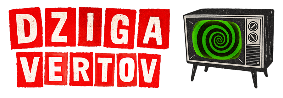
Dziga Vertov’s «kino-eye» proved that editing creates meaning beyond individual shots. This montage principle transforms art direction when applied correctly.
- Traditional montage: Sequential images over time create new ideas through juxtaposition.
- Commercial montage: Simultaneous visual elements within single frames create narrative meaning through strategic placement and interaction.
Great art direction is editing in a single frame.
Practical Montage Techniques
- Foreground/Background Relationships → What you place in front of what tells a story about importance, causation, and emotional connection.
- Color Temperature Montage → Warm foreground against cool background (or vice versa) creates emotional depth and guides attention flow.
- Scale Montage → Large and small elements in conversation suggest power dynamics, importance hierarchy, and emotional intimacy levels.
- Texture Collision → Smooth against rough, organic against geometric, matte against glossy — these oppositions create visual and conceptual tension.
Case Studies: Story Structure in Action
Apple «Shot on iPhone»: Minimalist Narrative
- Protagonist: User creativity (represented through extraordinary photographs) Conflict: Skepticism about phone camera quality versus professional equipment.
- Turn: The reveal that stunning images came from pocket devices.
- Signature: Clean white space, minimal typography, quiet logo placement
Why it works: The story isn’t about the phone — it’s about user potential. The minimal art direction lets user creativity be the hero while Apple becomes the enabler.

Always «#LikeAGirl»: Montage Revelation
- Protagonist: The phrase «like a girl» (starts as insult, transforms to empowerment).
- Conflict: Different age groups performing same actions with different confidence levels.
- Turn: The cut between confident young girls and self-conscious teens reveals learned limitation.
- Signature: The reframed phrase becomes rallying cry.
Why it works: Pure montage storytelling. The editing creates the meaning. Art direction serves the reveal through casting, staging, and pacing.

Your Storytelling Toolkit
Pre-Production: Story Before Style
- Write your one-sentence synopsis → «What happens in this image/campaign?»
- Identify your protagonist → What deserves viewer empathy and attention?
- Locate the conflict → Where’s the tension that creates story necessity?
- Plan the turn → What revelation or shift drives emotional impact?
- Design the signature → What distinctive element will survive in memory?
If you can’t explain your story in one sentence,
your audience won’t understand it in three seconds.
Production: Visual Narrative Techniques
- Compose for story flow → Use leading lines, scale, and placement to guide eye movement through narrative beats
- Light for emotional arc → Hard light for tension, soft light for resolution, directional light for revelation
- Color-code story elements → Assign specific colors to protagonists, conflicts, and resolutions for visual clarity
- Cast for narrative function → Choose faces, bodies, and expressions that serve story roles, not just aesthetic preferences
Production is where story strategy meets visual craft.
Post-Production: Story Optimization
- Test narrative clarity → Show work to strangers and ask what story they see.
- Refine for platform survival → Ensure story reads in thumbnail, mobile, and full-size versions.
- Measure story recall → Track what people remember, not just what they like.
The edit is where good stories become great campaigns.
Advanced Storytelling Strategies
The Incomplete Narrative Technique
Leave strategic gaps that force viewer participation. When people complete stories mentally, they become more invested in outcomes.
The Parallel Story Method
Show multiple narrative threads simultaneously through split screens, before/after comparisons, or symbolic juxtapositions.
The Sensory Story Approach
Use visual cues to suggest other senses — texture that implies touch, color that suggests temperature, composition that creates movement sensation.
The Time Compression Strategy
Suggest entire story arcs through single images by choosing decisive moments that imply what came before and after.
Common Storytelling Mistakes
Protagonist Confusion
Multiple elements competing for hero status. Viewers can’t identify who or what to care about.
Conflict Avoidance
Playing it safe with harmonious compositions that please committees but fail to engage audiences emotionally.
Premature Resolution
Giving away the story outcome too early, eliminating narrative tension that drives attention.
Signature Neglect
Creating forgettable visuals that don’t encode distinctive memory anchors.
Most campaigns fail not because they’re ugly,
but because they’re forgettable.
The Technical Foundation
Strong storytelling requires technical excellence. Poor execution kills good narrative concepts.
Lighting serves story
Every lighting choice should advance narrative meaning, not just create visual appeal.
Color supports arc
Color temperature, saturation, and contrast should guide emotional progression through story beats.
Typography carries voice
Font choices must match character roles — headlines as protagonists, body copy as narrators, callouts as conscience.
Composition controls pacing
Visual rhythm through element placement, scale relationships, and white space distribution guides story consumption speed.
Technical sloppiness kills the best stories
faster than committee feedback.
Platform Adaptation Without Story Loss
Social Media Storytelling
- Instagram squares: Focus on single story beat with maximum impact.
- TikTok verticals: Use vertical composition to create narrative progression from top to bottom.
- LinkedIn horizontals: Professional context requires subtler conflict and resolution.
Traditional Media Storytelling
- Print campaigns: Longer attention allows complex narrative development.
- Outdoor advertising: Story must read at distance and speed.
- Packaging design: Story unfolds through physical interaction and usage.
Professional Standards for Story-Driven Art Direction
- Every visual decision must serve the narrative. Decoration for its own sake weakens story impact.
- Cast for story function, not aesthetic preference. The «right» face is the one that best embodies your protagonist role.
- Measure story success through behavior change, not aesthetic approval. Did people do what your story asked them to do?
- Protect story integrity across revisions. Client changes that undermine narrative structure should be resisted with alternative solutions.
Building Your Story Instincts
- Study film editing techniques and apply montage principles to static compositions.
- Analyze successful campaigns by identifying their four-beat structure rather than just aesthetic choices.
- Test story clarity by showing work without context and asking viewers to describe what they see happening.
- Practice visual metaphor creation — find unexpected ways to make abstract concepts tangible and memorable.
The Professional Reality
Most campaigns fail because they prioritize approval over impact. Because they choose harmony over story tension. Because they forget that art direction’s job is creating narrative meaning, not just visual pleasure.
Decoration is optional. Story is mandatory.
As art directors, our responsibility extends beyond making brands look attractive. We give them narrative voice, emotional arc, and memorable conflict that drives behavior change.
The best art direction becomes invisible because it feels inevitable — when someone looks at your work and thinks «of course it looks like that,» you’ve created not just a visual, but a visual truth that serves the larger story you’re telling.
In an attention economy where everything competes for human awareness, art direction as storytelling isn’t just a creative philosophy — it’s a competitive necessity.
Pretty gets permission. Story gets results.
FAQ — People Also Ask
advertising advertising case studies advertising effectiveness advertising history advertising strategy art direction brand consistency brand consistency examples brand consistency problems brand consistency vs flexibility brand design brand identity brand inconsistency examples branding brand name history brand naming strategies brand narrative engines brand salience brand storytelling cinematic advertising commercial design consumer behavior copywriting for brand names copywriting tips creative direction creative strategy creativity in advertising design strategy digital branding archetypes dynamic branding flexible branding hero’s journey importance of brand consistency marketing psychology marketing strategy mental availability modern brand case studies modern brand storytelling naming as copywriting naming in branding narrative branding ugly ads vs beautiful ads performance visual communication what is brand consistency when brand consistency is overrated
